My
group and I presented our
pitch to our class, which included ideas for our promotional package. At the
end of the pitch we gave our peers a chance to give us their honest opinions on
our ideas, which allowed us to gain some constructive criticism. The feedback
we received was extremely beneficial, and we believe that this has all
contributed to making our narrative/ trailer ideas much more effective. Our
peers suggested that the narrative/ trailer be based around a specific object
due to a convention in many Supernatural/Possession films; for example in ‘The
Possession’ there is something that triggers of the possession itself (The
young daughter purchases a box at a yard sale) making it clear to the audience
that there was a reason for possession. Within our narrative the reason for the
possession is to seek revenge, but we needed something to trigger this of so we
decided to make the possession come about on the day of Genner’s birthday which
will then make it obvious to the audience who it is that is possessing Jamal. In
addition to making that specific day special. Furthermore there will be previews
of the burning photo that Genner destroyed before committing suicide, in order
for the audience to understand reasons for Genner’s death, as well as show who
Genner is distinctly going after on her mission for revenge. We were also told
that if Jamal and Taylor were not clearly presented as a couple than the
narrative would not be so effective. Taking this into account we have decided
to portray the couple as affectionate, loving and indulged. This will allow the
audience to have a clearer understanding, as one of the very first shots within
our trailer will be of the couple enjoying each other’s company in the common
room, proving it to be clear that they are in fact an item. Taking this into
account we have altered and improved our narrative.
Thursday, 17 October 2013

Tuesday, 15 October 2013
FRONT COVER OVERVIEW

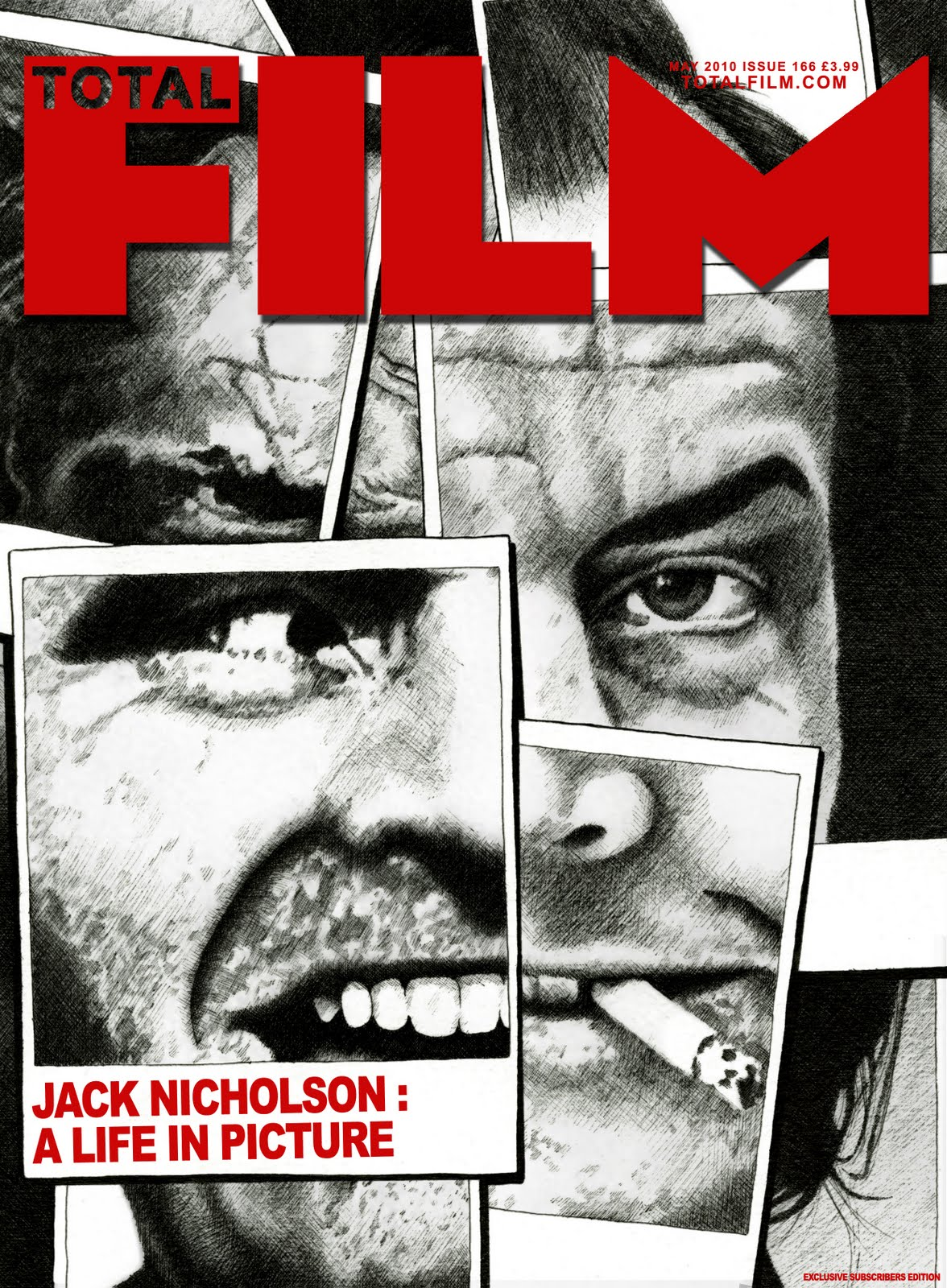

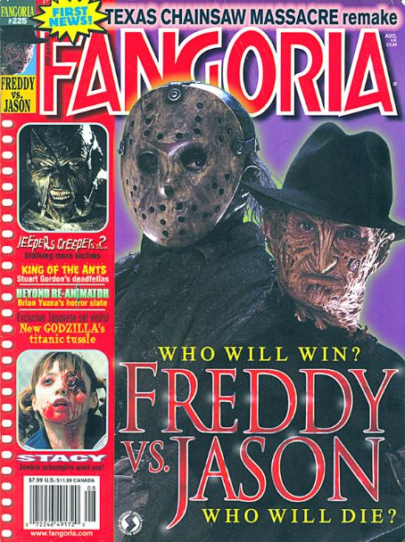
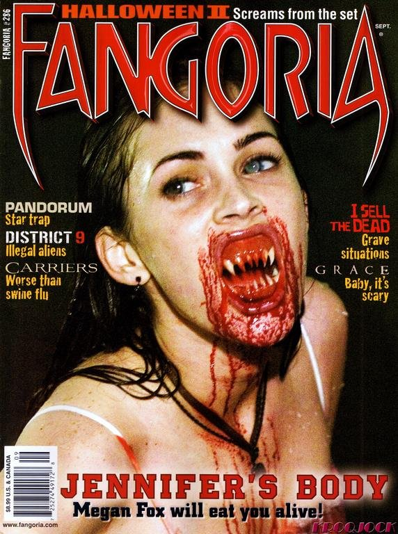
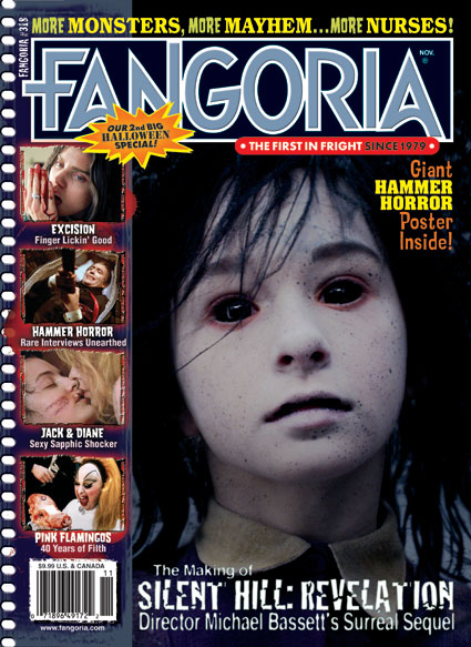
The following magazine cover are to promote horror films. Empire and Total Film are mainstream film magazines which featured a horror special on the front covers; However Fangoria are niche horror magazine which oversees all subgenres of horror. Through carrying out research, I will identify the similarities between all of them and evaluate repeated patterns in each of them.
All six magazine covers feature the common convention of using the following colors that are associated with the horror; red, black and white. Also a medium/close ups of the main image on the front cover. The master head is dominate text on the cover to show the importance of the magazine’s identity.
All the following covers feature the Protagonist as the main image, this shows the audience who will be featured in the film and also the importance of the character in the film featured. Thus the audience will be curious as to what the narrative of the film is. On the Total Film cover, the main image is in black and white with what seems like various snapshots of the character; this illustrates that the protagonists has many different sides to him, his character is quite Bipolar. The images used look arguably normal for villain as a result giving the idea that the subgenre that the film belongs to is psychological because conventionally the antagonists are ‘normal’ people who suffer from some kind of mental issues. Due to the colours used for the main image the master head stands out so the audience and the fans of the magazine will be able to identify what magazine it is. Also the different images that are used are all connected together consequently giving the idea that the character has many victims in the film but also the his victims are all somehow connected to each other or perhaps they have things in common in which attracted the antagonists to victimise them. Furthermore the fact that the images are in black and white connotation gives the feeling that the antagonist is use to his malice; if the following images were in colour it come off as fresh and new but due to no color it comes off as old and repeated as if his actions have been done before.
Total Film cover has similar features to the Empire cover, which also introduces the antagonist in a medium close up which exposes his costume of him wearing a mask and a straight jacket which links into someone with a mental health issues. This already tells the audience what sub genre it is therefore fans of the particular sub genre would be attracted to it. But with the mask it gives a slasher feel due to the conventions of slasher villains wearing masks when going on killing sprees so it may also attract the attention of slasher sub genre fans too. The use of direct addresses with the main image allows the image to connect with the image but it also creates a sense of fear in them because they might feel as if they are the next victim due to mask on his face is makes him seem a lot more intimidating. Unlike Total Film cover, Empire features a sell line and the name of the film. The sell line that is used is a pull quote from the film itself the quote reads “Tell me, ma’am, when your little girl is on the slab, where will it tickle you?” this contrast the main image completely because unlike the look of the cover the quote sounds friendly and approachable . However this is common of the psychological horror or just the overall genre in general to turn something that may seem innocent into something evil and sinister. In term of psychological, perhaps at the beginning of the film the antagonists comes across as a normal man but as more of the narrative is revealed to the audience they will find out that he is not as habitable as he makes out to be. This make him even more terrifying for the audience because it will build a fear in that they come across anyone like in reality; it also gives the narrative a more realistic feel.
The direct address used on the Fangoria cover is put in a violent term so links with the main image; ‘Megan Fox will eat you alive!’ They addressed the name of the actress to draw a wider audience. But it quite unusual as it is not common to have a famous actor/actress featured in the films. Through the use of mise-en-scene of the blood her face is evident of the sell line because it looks like she has just eaten someone alive thus the audience will feel more frightened. It also adds to the realism of the horror.
Monday, 14 October 2013
POSTER OVERVIEW


The following posters are made to
promote the horror films within the supernatural/possession sub-genre. I will
be comparing the posters by finding the common feature in each of them which
will allow me to establish repeated patterns.
All six posters follow the general
convention of a film poster such as; large title font, which is the most
important text in the frame, a main image which also dominates the poster
signifying that the person in image is the main character in the film, a slogan
that attach the image and also anything horrific imagery that will show that it
is a horror film.
We see a repeated pattern of the
character in the image looking directly at the camera which gives a connection
between the poster and the audience because they will feel that the image is
aiming right for their attention for example ‘The woman in Black’ poster the
main image is a close up of the character looking directly at the camera,
though his face is very faint the focus is on the colour of his which is bright
blue, making it even more interactive. There is also another image, except this
time it is a horrific imagery that gives the audience the idea that this is in
fact a horror film poster; the ghostly image is behind the main image which
gives the impression that the next victim is the audience. However ‘The
Possession’ poster has no direct eye contact with the audience because the main
image is facing the opposite direction, though the horrific imagery that is
presented in this is a distort hand reaching out from someone’s mouth. The
suggestion is that in supernatural/possession films the main focus is that the
supernatural element of the narrative is the very significant in order to carry
out a successful horror film of this sub-genre.
With all the posters, there is a
variety of camera shots used; long, close up and medium close up shot. This
shows that within the genre of horror there are many different types that can
be found in order to suite each fan. When a medium/close up, it is because they
want to focus on the main image but also its surroundings so that it will give
the audience an idea of what the film will involve for example with the
‘Insidious’ poster the main image is of a young child, in the background of
this a house; though the main attraction of the poster is the character of the
poster, if the audience were drawn by the main they will want to gain more
information of the film so therefore their attention will then lead to the
background which is of house.
Along with the typography of the
font, they are all uppercase however not all of them are serif; for the poster
which use serif fonts, they seem as if they appeal to an older audience because
they look professional and sincere which therefore shows that the following
films are authentic which gives a feel of fear for the reason that it will give
the idea that the film is very petrifying which will then fulfil its full a
horror potential. However posters such a ‘The Woman In Black’ and ‘Insidious’
use a sans serif typography which give them a slight different fell to the
poster due to the fact that it does not distract you from the main image of the
poster which is of a significant character in the film. For instance with ‘The
woman in black’ the main character is important on the poster because he is a
famous actor who known worldwide, so therefore this will allow the film to gain
a wider audience whether they are horror film admirers or not they will be open
to go and watch the film simply because of the actor that is placed on the
poster. Together with the ‘Insidious’ poster, the main character is placed on
the poster because throughout the film he is the most significant character
consequently the typography does not stand in the way of the audience getting
to know the character before they watch the film. There is a common pattern
which has been followed though all of the posters, which the destruction of the
typeface. For instance with ‘The Possession’ poster the typography looks like
scratched surface; this gives a basic tendency possession sub-genre films
because usually when someone is possessed by an evil spirit they tend to
scratch a piece of equipment or even do damage to their body having said that,
the poster illustrates a characteristic of a person being through the use of
the typeface. This is also presented in the ‘Sinister’ poster, where the
typeface looks like the colour of the font is saturated down the walls, which
gives it a supernatural atmosphere.
All of the following
supernatural/possession horror posters feature a tagline. This helps to entice
the audience because their curiosity of the film develops which them will
convince them to watch the film. For instance the tagline for the devil inside
reads ‘No soul is safe’ this contradicts the main image which is of a nun
because they are seen as holy people so for that tagline to say is definitely
going to terrify the audience meanwhile a holy person cannot save themselves
from an evil spirit how is an ordinary person going to do that. So unquestionably
it will place the fear into the audience. Alongside with the ‘Insidious’
tagline which reads ‘it’s not the house that’s haunted’ this gives the
impression that perhaps the child on the poster is the demented one, he may
have been possessed. This has also picked on something that may come as a
surprise to the audience because children are seen to be innocent beings and to
be involved in something this evil is fear-provoking. The tagline also leaves a
sense of curiosity in the audience because they are left with the unknown, it
provokes them to go watch the movie in order to find out what exactly is
haunted.
Sunday, 13 October 2013
Saturday, 12 October 2013
THE CONJURING TRAILER ANALYSIS
Subscribe to:
Posts (Atom)